

About a year ago I started working with a successful wearable-device company. This company hired me to help them with two main challenges:
- Make their organization more data-driven
- Help them better understand their product retention and usage
In this post I'm going to cover how we achieved these goals and how you can do the same for your own organization. The lessons I share in each section are relevant for any organization making significant changes to their BI infrastructure.
My client was kind enough to agree to me writing this case study but I decided to keep their identity private so that I can share as much as I can about the process and what we learnt.
Discovery and data audit
The first step I take when helping a client become more data-driven is to conduct a discovery and data audit.
The main goals of this phase include:
- Learning the business. This includes target market, sales cycle, the product and anything else which may be relevant.
- To get a sense of the existing tools, systems and data.
- To write up a road map, a project list, and any major concerns or road blocks I identify.
I learnt the following information about my client during the discovery phase:
- They sold a wearable-device that synced with your smart phone via an app.
- They had apps for both iOS and android devices.
- They were collecting a lot of data on the usage of their device.
- Their data silos included a MySQL database, Intercom and Firebase analytics.
- There were a number of possible ways to make the company more BI-friendly.
The BI road map for a wearable-device company
After the initial discovery of the business, I was able to draw up a road map for centralizing the companies data in a data warehouse.
The idea is to move all the relevant data into a single data base to make it easy to build dashboards and to conduct analyses. This would allow a quicker delivery time and to allow more individuals to get value from the company's data.
A data warehouse would also make it easy for future analysts to immediately provide value to the company.
An overview of my plan can be seen in the diagram below:

The BI stack that I recommended to my client included:
- Data warehouse: BigQuery
- ETL solution: Stitch
- Event tracking: Segment or Firebase (we ended up sticking with Firebase)
- Dashboarding: Tableau
Key lessons learnt during the discovery phase:
- The costs involved and available budget are the two most critical variables that need to be discussed at this stage. Implementing BI infrastructure is costly and a long-term investment.
- There were a number of nuances related to Firebase that needed further investigation. We didn't want to leave any doubt in our plan and I conducted a lot of research on the limitations of Firebase. In the end Firebase was more than what we needed and since it was free, we stuck with it.
Data silos and BI stack
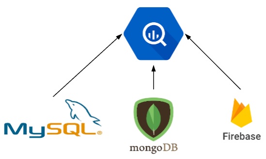
My client had their product data spread out in a number of different data silos. These included a MySQL database, Intercom and Firebase. At a later stage a MongoDB was also introduced which added complications.
Since Firebase would act as our event tracking solution, and it has its own integration with BigQuery, I decided to go with BigQuery as our data warehouse.
The challenge was to move the MySQL, MongoDB and Firebase data into BigQuery.
We managed to move these sources into BigQuery by using a combination of ETL scripts that we wrote and Stitch. Before we started moving these sources into BigQuery we made sure to set up a replication process so that the scripts and Stitch were not running on the production databases.
We were able to easily push the Firebase events into BigQuery by using the native integration between the two tools.
One major advantage of BigQuery is the ease of creating views. Once I had all the data silos in BigQuery I could build smart tables made up of data from numerous sources.
One example of such a table is the "master users" table. This table includes user properties and aggregations from all the data sources. Each row represents a user and the columns represent user-specific information. This table would become central in all the dashboards I built for the product team.
Key lessons learnt during the implementation phase:
- It was very helpful to have a point of contact within R&D. After completing a few of these projects, I'd say that it is critical to have one person in R&D that can work with the analyst / BI consultant.
- A few months after starting the process the company made a major change to their back-end. This created a ton of issues with the road map and a lot had to change. One change was adding MongoDB to the tech stack. MongoDB is not very BI-friendly. We worked through these changes and adapted.
Setting up Tableau
A critical piece of the BI puzzle is data visualization. A data warehouse provides a ton of value to analysts but in order to share that value, you need dashboards. Tableau is my first choice and thankfully my client trusted my decision to go with Tableau.
One major decision that needs to be taken when setting up Tableau is to go with Tableau Online or Tableau Server. There are a number of pros and cons with each which I've covered in detail in this introductory post to Tableau.
In order to speed up the process and eliminate reliance on R&D we went with Tableau Online. We started with a single license of Tableau Online and Tableau Desktop.
We introduced Tableau on day 1 because I was able to connect to replicas of the data silos and conduct analyses for my client.
I was able to answer key questions relating to retention by accessing usage data and working with it in Tableau Desktop.
Retention and usage dashboards
Once the initial data was being pushed into BigQuery I as able to focus my energy on building robust dashboards for the product team.
Below are some screenshots of some of the dashboards I built for my client.


Notice the user-level filters like gender and age. Since all of our product data is in one database, BigQuery, it is easy to blend it with usage and retention data and then build very robust dashboards.
Key lessons learnt during the dashboard building phase:
- It took time for me to understand the style of data visualizations the key consumers preferred. I've learnt to take my time with building dashboards and work as closely as I can with the consumers.
- Training and follow ups are also critical to improving adoption of dashboards.
Summary
When my client hired me 12 months ago they needed help better understanding their product retention and usage.
Today the product team has a number of powerful dashboards that they use to track key KPIs and answer ad-hock questions on their own.
Their data warehouse continues to scale as does their user base and the foundation is in place to quickly analyze their product and users in the form of analyses or dashboards.
The head of product and his product manager are using these dashboards to frequently update the CEO and other executives in the organization. Overall everyone in the company is smarter when it comes to understanding how people are using their device and mobile apps.
Thanks for reading.


