


The retention curve is a useful visualization for measuring product stickiness. In this post I'm going to teach you how to create a retention curve, read it and avoid some common pitfalls when building the visualization.
What is a retention curve?
A retention curve is a visualization that represents the average retention of some dimension, usually users / accounts, for a certain set of time periods.
Below is a graphic showing the retention curve for a hypothetical business.
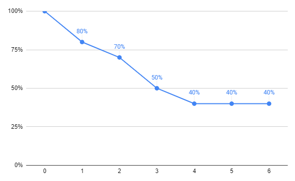
This retention curve example shows weekly retention for the first 6 weeks after signing up. At point zero everyone is included hence the 100%. That percentage will naturally drop over time as users stop using the product.
Notice that after 3 weeks we are left with just 50% of our users. This drop might seem dramatic to you but for most businesses only a small percentage of users stick around.
After 4 weeks we are left with 40% but then the line flattens. This is very key since it tells us that for a percentage of users, the service is valuable enough that they stick around for the long-term.
How to create a retention curve?
To create a retention curve, you first need to calculate your retention rate for the time period you care about.
This means you need to decide how best to measure retention for your business. The rule of thumb that I use is weekly retention but it depends a lot on your expected user behavior. For some applications, if the user users the service once a month that's enough. In such a case monthly retention would be better than weekly.
I also suggest calculating everything within windows of x days. So if you're going with weekly retention then normalize your data set by dividing by 7 days. So for example if you're going with weekly retention, the data point "1" in the visualization would represent "within 7 days" of signup. "2" would represent, between 7 and 14 days since signup. This is important since users can use the service on any given day, and don't all signup on the same day in the week.
I have an entire blog post dedicated to retention rate which you can find here: What is retention rate? A definition, guide & FAQ
A typical retention table will look something like the table shown below.
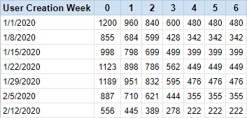
In this example we see the 6 week retention for 7 different weekly cohorts. This table shows absolute numbers of users.
The next step would be to manipulate the table to show percentage of total.
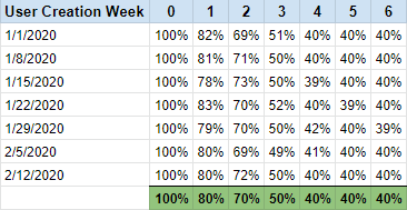
The row I've highlighted in green is the average for each column for all 7 rows (user cohorts). This average becomes our retention curve.
To go from the table above to a data set you can quickly turn into a line graph, simply ungroup by user creation week, and pivot so each column becomes a row.
Common mistakes analysts make when creating a retention curve
Building a retention data set which can be pivoted to create a retention curve is tricky. Below I've listed the most common mistakes you can make when working on such an analysis.
Not choosing the correct user cohort
A retention curve represents the retention of a subset of users. For this reason you need to be selective as to which subset of users you choose for your analysis.
For a start, you must only choose users which joined the service far enough ago so they had enough time to be retained.
Let's take an example.
Let's say you want to build a retention curve which shows weekly retention for the first 12 weeks of a user's lifecycle.
A user who has signed up 3 weeks ago has only had the opportunity to be retained for three weeks out of the 12 you care about. This user must not be included in your data set.
For my example above, you'd need to only include users who signed up more than 12 weeks ago.
Another way to think about this common mistake is to avoid using a data set which will result in blanks appearing in your retention table.
In the example above, you have blanks. Even if the averages are the same, it's not a clear representation of your user retention. For earlier data points in your retention curve you'll have many data points, while for later data points you'll have significantly fewer.
The downside of only using "complete" data sets for building your retention curve is that it means needing to wait until you have enough data. The longer your retention curve, the longer you need to go back.
This can result in a misrepresentation of the current reality since your product, marketing, and pricing may have changed quite recently thus shifting your retention curve significantly. Like most things, there is a give and take.
Forgetting to remove users that deleted their account
It's not enough to only include users that signed up a long enough time ago, you also need to remove users that deleted their account sometime within the time period you're checking for. A user might have signed up before the 12 week period in which you want to check their retention, but perhaps on week 6 they deleted their account.
In such an example, the user didn't really have the opportunity to be retained between weeks 6 and 12.
The bottom line is that you need a clean data set where every user included has equal chance to show up within the retention table in every cell.
Blended view vs. cohort view
The traditional retention curve is a blended view. What I mean by this is that the curve represents a collection of users. You may have a very wide distribution of users within the retention curve data set.
At the end of the day the key decision makers need high-level metrics to make decisions, but as an analyst you should dig deeper.
Let's look at an example to emphasize this point.
Let's say you decide to check the blended retention curve compared to the retention curve of users that used a specific feature at least twice within 24 hours of signing up. You do this since you have a hypothesis that this feature is very influential on communicating the value of the service to the user.
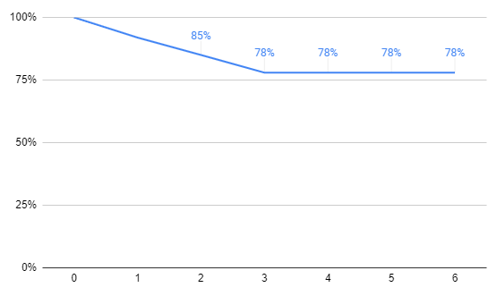
To your surprise you notice the retention curve shifts up significantly. Users that meet the criteria are almost twice as likely to be retained for the long run (flattening out at 78% compared to 40%), and the line flattens out 1 week sooner than the blended cohort.
Another popular way to use a retention curve visualization to show change is by displaying multiple cohorts in the same visualization.
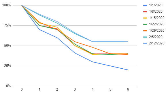
In the visualization above you can see multiple curves, each representing a different signup week. If you look closely you'll notice that the most recent lines are higher than the rest. This indicates that the company is getting better at retainer its users over the first 6 weeks of their lifecycle.
My final thoughts on retention curves
The retention curve visualization is an important viz for all B2B and B2C online businesses.
The retention curve is one of the few visualizations that can really help hammer home the point that the business has or hasn't reached product market fit.
The retention curve can be a tricky visualization to build. There are a number of pitfalls which you'll have to avoid when building this visualization.
I hope this post has helped explain some of these pitfalls and how to get around them.
If you have any questions on retention curves then write them in the comments section below.


