


The concept of data normalization is one of the few concepts that come up over and over again during your work as an analyst. This concept is so critical that without fully understanding it's importance and applications, you'll never succeed as an analyst.
In this post I'm going to cover, in detail, the concept of normalization of data and how to normalize data in Excel and Tableau. The concepts covered in this post will be relevant for a wide range of the analyses you run in the future, no matter the tool or tools you use.
What is data normalization and why do I need to normalize data?
Imagine two farmers, Bob and John.
Bob and John have apple orchards that produce tons of apples each season. Now imagine I told you that Bob produced 10 tons of apples in 2017 compared to John who only produced 6 tons.
Without any additional information you'd have to say that Bob is the more productive farmer but this would be a very naive argument to make.
Now think as an analyst. What information would you need to determine which farmer is more productive?
As an analyst I'd want to understand all the variables involved in the output of these farmers. These variables may include:
- Size of orchards
- Number of farm workers
- Geography
- Etc
Let's assume that both farmers are located in the same geography but Bob has 1,000 hectares of orchards while John only has 400 hectares. Let's assume both farmers have an equal number of farm workers in relation to the size of their farms.
We can now say that Bob managers to produce 10 tons from 1,000 hectares of land (1 ton per 100 hectares) while John managers to produce 6 tons from 400 hectares of land (1.5 tons per 100 hectors). John is now clearly the more productive farmer.
The basic idea behind normalization of data is to bring equality to the numbers in our analyses. If we don't take into account inherent unfairness and flatten them out the variables then we will end up with incorrect results which could lead to disastrous consequences.
If we were a bank and wanted to give a loan to the more productive farmer, and we didn't normalize our data, we would have picked the least productive farmer.
The time element in data normalization
Another very common use case for data normalization is adjusting for time. In the example above I mentioned that the output was produced in 2017. If instead of providing a time constraint I mentioned that the tonnage was produced in the "lifetime" of each farmer you'd now need to account for time.
Time is a variable which affects all business metrics to some extent and you'll need to constantly adjust for time.
Cohort analyses like the one shown in the image below will by their very design, normalize for time but most other data visualizations won't and you'll need to do some extra work.

The table above shows a cohort table with each row representing a group of X with each column representing a time period (day, week, month). Each cell when looking down is equal to the cell above it in terms of time.
How to normalize data in excel?
In order to normalize data in excel you'll need to familiarize yourself with the formulas I've listed below.
The IF function will help you create flags which will act as filters once we start slicing up our data. The DATEDIF function is very helpful in helping us determine how many time periods (days, weeks, months, etc) have passed between two dates. The AND function will save you a bunch of time building flags which take into account 2 or more helper columns.
Let's take a look at an example and how these formulas will become critical in helping us normalize data in excel.
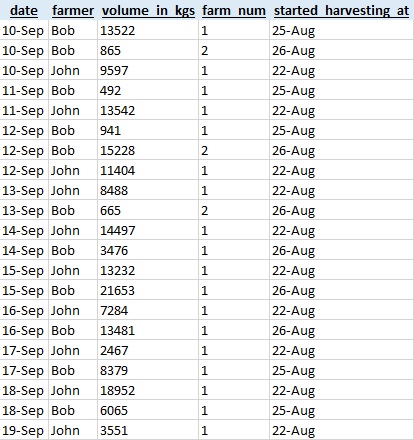
Let's imagine we have a data set like the one shown above. The data contains info on the amount of kilograms of apples that are harvested each day grouped by farmer and farm.
Let's say you're tasked with calculating which farmer was more productive in the first 30 days of the harvest from their first farm. To work this out we need to flag the relevant rows and then we can simply group by the farmer.
To determine which rows are relevant we'll need to create some helper columns. The first would be DATEDIF to determine if the harvest day is within the first 30 days of the start of the harvest. The formula I'd use would be:
=DATEDIF(E2,A2,"d")
This would give me the number of days between the start of the harvest and the harvest day. Later I'll check if this number is smaller or equal to 30.
The next helper column we need is a flag to determine if the row is related to the first farm. We already have such a flag in the "farm_num" column so we don't need to create this flag.
Lastly we want a "master" flag which takes into account the two variables, "is the first farm", and datediff being smaller or equal to 30. To add this flag I'd use the following formula:
=AND(D2 = 1, F2 <= 30)
The next step is to run these two extra fields down my entire data set. You should end up with something similar to the screenshot below.

The last step in this entire process is to create a pivot table and use our new "is_relevant_row" flag as a filter.

The concept is the same no matter which data set you'll working with. You want to work out the variables which are relevant and then make sure you manipulate your calculations to take the differences into account.
How to normalize data in Tableau?
Normalizing data in Tableau is very similar to how you'd do it in Excel.
The formulas that you'll use most often in this kind of work are:
Once you've loaded the data set into Tableau create the datediff calculated column using the formula below:
=datediff('day',[Started Harvesting At],[Date])
After creating the datadiff helper column go a head and create the master flag by using the IIF formula.
=iif([Farm Num] = 1 and [Datediff(d): started harvest --> Date] <=29,1,0)
Now that we've got all the helper columns we need we can create our pivot table by dragging "Farmer" into rows, "volume_in_kgs" onto the marks area and finall, sett our master flag as a filter.

Final thoughts on normalizing data
I find the goal of normalizing data during an analysis a fun challenge. There is something fun about building logic to limit your sample size in a way that makes everything fair.
Thanks for reading.


