

An outlier is a data point which differs significantly from others in the dataset. Outliers can wreak havoc on statistical analyses and there are times you'll need to identify them quickly within your dataset so they can be removed (or investigated further). This post will teach you how to find an outlier (or outliers) within a dataset quickly.
In this post you'll learn how you can use Tableau and Excel to find outliers in your dataset. If you grasp the main concepts shared in this post, you'll manage to find outliers using whichever analytics tool is available to you.
How to use Tableau to find outliers
Method #1 - Use a packed bubble chart (AKA "The Flower") to identify outliers
The first method you can use to identify outliers in your data is to create a packed bubble chart in Tableau. Below is an example of such a view.
In the example below you see a circle for each data set (in this example I'm using orders from the superstore dataset). The size and color of the circle matches the sales amount for each order. The bigger and darker the circle, the larger the sales amount. It takes you only a second to identify the outliers among all the data points.
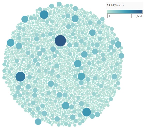
If I was a sales manager I could use this view to find outliers to investigate. I often build this type of view for my clients since you can pick any key dimension for your circles and use parameters to dynamically change the size and colors of the circles. This makes such a view very useful for finding all kinds of outliers hiding within the data.
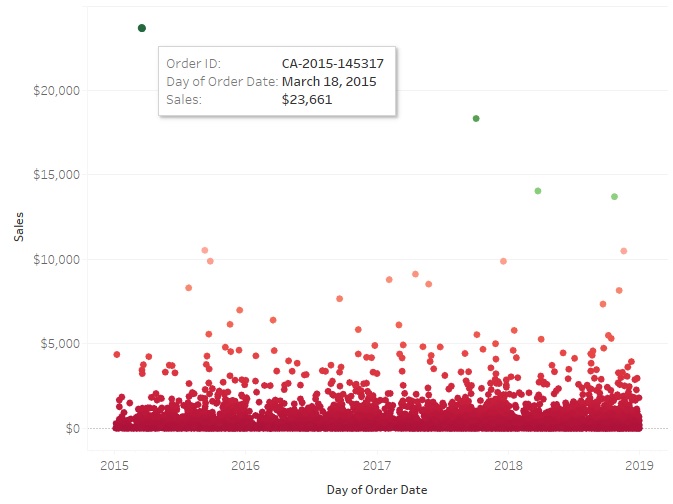
Method #2 - Use a standard scatter plot chart
The second method you can use in Tableau involves creating a scatter plot chart with an X and Y axis. The image below shows an example of a scatter plot based on the same data I used for the packed bubble chart. The only difference is in the scatter plot we have two axis, sales and date.
Date in this case is irrelevant but it does help to space the data points out so we have a common "level" where the majority of the data points are situated.
I've once again used color to help the outliers stand out from the rest. In this scatter plot chart, the outliers are the circles located high up in the image.
How to find statistical anomalies (AKA outliers) using Excel
Excel, just like Tableau, has great data visualization capabilities. If Excel is the only tool you have available to explore your data and find outliers then I recommend that you create a scatter plot chart just like the one shown below.
To create a scatter plot graph in Excel click on "Insert" and then select the scatter plot chart type from the charts section. You'll need to pick the relevant data set, series name, X and Y axes.
Once the scatter plot is built, you'll be able to easily identify outliers in the data set.

Summary
In this post I've shared 2 different methods on how to find an outlier in a dataset. The best way to find an outlier in a dataset is to create a visualization that will make the outlier stick out like a sore thumb. Tableau and Excel are great for displaying large volumes of data so outliers can be identified. Once you have built a visual of your data which shows each data point, and where it falls within a scale of the measure you are checked against, you'll be able to identify outliers effortlessly.


