


A KPI dashboard, or key performance indicator dashboard is a visual representation of the most important metrics of the business.
This makes the KPI dashboard the most important reporting tool in the business. A good KPI dashboard will help keep the organization data-driven, more focused, and everyone heading in the right direction.
In this post you'll learn the following:
- What is a KPI dashboard and why is it important.
- How to plan your KPI dashboard
- How to build a KPI dashboard in some of the most popular reporting tools on the market
- Best practices for building a world-class KPI dashboard (with many good examples you can learn from)
What is a KPI dashboard and why does my business need one?
As I mentioned at the start of this post, a KPI dashboard is a data visualization of the most important metrics in the business.
Most online businesses have a few key drivers which determine their growth rates, profitability, margins, etc.
Let's take the classic B2B SaaS business for example.
A B2B SaaS business like SalesForce has the following levers for growth and profitability:
- Customer acquisition cost (CAC)
- Life time value
- Churn / retention rates
- Leads
- Sales qualified leads
- Opportunities
- Average order value
- Net promotor score (NPS)
- Account growth
- etc etc
All of the metrics listed above are important to SalesForce. If any one of these metrics starts shifting in the wrong direction they may be in trouble and their projections will be off.
It is critical that SalesForce keep an eye on these metrics (and I'm sure many others) so the company can act quickly if these key performance indicators start heading in the wrong direction.
Once a company has picked their most important key performance indicators, the next step is to track these metrics in a dashboard. This dashboard becomes the KPI dashboard. The KPI dashboard is often referred to as the "CEOs dashboard" or the "executive dashboard". I've also heard "company dashboard", and "leadership dashboard".
KPI dashboard example
Below is a screenshot of the "War Room" dashboard in my 360° degree reporting solution for eCommerce businesses.
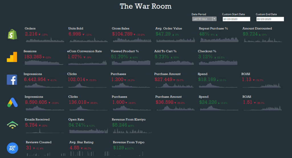
This KPI dashboard contains the most critical success metrics from all the major data sources for the Shopify business.
Each of these metrics is a driver for the business. Some metrics, like in the case of the Google Analytics metrics (second row of numbers) are related to the top of the funnel, while others, like repeat purchase %, are end of funnel metrics.
Notice how each metric is colored either in green or red. This makes it easy to see which metrics have improved and which metrics need attention. The % change next to each metric shows the size of the change.
How to plan and design a KPI dashboard?
Building a robust, focused and easy-to-use KPI dashboard takes time and expertise.
I recommend assigning the task of building a KPI dashboard to a senior business analyst or data consultant.
If you're an early stage company and don't have the resources yet to hand the project to a specialist then the CEO should be responsible for building the dashboard.
My post on how to build a traffic dashboard will be a useful resource if you're in this position.
Your KPI dashboard should meet the following criteria:
- As focused as possible: Try and limit the number of widgets if possible. Think top down and start with a few obvious metrics for version 1 and then expand if necessary.
- Build the dashboard for the top decision makers: The dashboard should be built with the CEO, CFO, CMO and CPO in mind. Once these decision makers have visibility into the most important drivers of the business, you can then start providing reporting to other decision makers.
- Easy to use with limited filtering and selectors: The KPI dashboard should be high-level without extra bells and whistles. There's no need to add multiple slicers, filters and selectors. The focus is on showing high-level metrics and change over time.
- Include targets to provide context: A good KPI dashboard will include the targets for each KPI for the given period, usually calculated quarterly. By adding targets you're communicating a clear message to the consumers of the dashboard. This approach will help keep the key decision makers aligned to the goals for the quarter.
What is the best KPI dashboard software?
The truth is that there isn't a single best KPI dashboard software on the market. The best option for your business will depend on the following factors:
- Budget
- Access to data visualization expertise
- Stage of the company
- How data-driven the company is and wants to be
An early stage company which is pre-product market fit does not need to invest a lot of resources in building out a sophisticated KPI dashboard.
If you are working with an analytics consultant, or have someone who is data-driven on your team, then it makes sense to invest some resources to develop a KPI dashboard since the impact of a good dashboard will be significant.
As a rule of thumb I suggest going with Tableau as your data visualization solution. I am biased since I've used Tableau for many years now but I've also built dashboards using PowerBI, Google Data Studio and other solutions, and Tableau is the best there is.
How to build a KPI dashboard in Tableau
Building a KPI dashboard in Tableau is a multi-step process. You will need to complete each step before you can move onto the next.
Step #1 - Determine your list of KPIs for version 1 of the KPI dashboard
The first step in the process of building a KPI dashboard in Tableau is to draw up your list of KPIs.
You want to start with a short list which covers the most high-level KPIs of the business.
A good way to think of this list is by looking at the core funnel of the business.
Below is an example of the core funnel of a B2B SaaS business.

From the diagram above we might come up with the following short list of KPIs:
- Top of funnel (marketing)
- Leads
- Sales
- Deals
- Customer Success
- Onboarded Customer Rate
- Renewal Rate
Version 1 of our KPI dashboard might only have 4 or 5 KPIs which is fine. Notice how I grouped the KPIs by department. This is important because we want to define clear ownership for each KPI.
Step #2 - Conduct a data audit and understand what you can connect to Tableau
Before you can even get started building a KPI dashboard in Tableau, you first need to know which data sources you can and can't connect to Tableau.
A data audit will help you understand which of your data is available to you, and which of your data is locked behind an API, or can only be accessible via a manual export.
The single biggest barrier stopping you from creating an all encompassing KPI dashboard is the inaccessibility of certain data silos.
It can take a lot of R&D time and resources to provide you access to the data you need so keep this in mind.
What many companies do to get around this process is a hybrid approach in which they connect to accessible data sources, and cover the rest manually by updating spreadsheets once a week / month. This isn't optimal but often the quickest way to go from flying blind, to understanding where the company stands.
Step #3 - Start building your data sets in Tableau
Once the audit is completed and you know what is accessible and what isn't, it is time to start building data sets in Tableau.
Each KPI needs to be covered so map each KPI to its relevant data source. In some cases multiple KPIs can be tracked from a single source. A good example of this is customer success and financial metrics which are often all available in the CRM.
Now since you will be covering KPIs from multiple areas of the business, you may end up with many different data sets in Tableau. this is completely fine since Tableau allows you to show data from multiple sources in a single dashboard. The screenshot I shared above of my eCom war room dashboard has data from 6 different sources.
Step #4 - Start building vizs for each KPI and combine in a single dashboard
The next step is to start building vizs for each sheet. I recommend going with plain numbers, or at the most bar / line graphs for your KPIs. Remember, we want the dashboard to be clear and simplistic.
You may end up with many sheets which is fine. Next, you want to start building your dashboard in Tableau.
Step #5 - QA and delivery
The last step in the process is to QA the numbers in the dashboard with the owners of each KPI and deliver the dashboard to the c-level.
I recommend showing the dashboard to each of the KPI owners separately and compare the numbers you see in the dashboard to the numbers the owners are familiar with. If you're lucky the numbers will match. If not then compare the way you calculate each metric with how the owners calculate each metric and decide how best to track each KPI.
You may want to consider recording the finalized logic in a data dictionary or internal knowledgebase.
Once you're dashboard is aligned it is time to deliver it to the key decision makers in the organization.
I suggest putting aside at least 1 hour and aim to accomplish the following during the session:
- Cover the motivation for building the dashboard.
- Overview of the metrics and how each are calculated (keep it high-level, no need to get too sophisticated).
- Show the decision makers how to access the dashboard and use it.
- Mention any planned changes and additions for the next version.


